Key takeaway
Strategic Packaging Redesign and Visual De-cluttering can transform a value-driven brand into a “Shelf-Hero,” using Minimalist Design Principles to increase brand salience and maintain market share during significant regulatory price shifts.

Strategist’s Insight – Padraig Smith
“In 2022, the introduction of Minimum Unit Pricing (MUP) fundamentally changed the value proposition for Dutch Gold.
By stripping back decades of visual noise and leaning into the literal ‘Gold’ of the brand name, we gave the product a premium tactile quality that justifies its new market position while hero-ing the iconic sailor for instant recognition.”
The Brief
Dutch Gold, a staple of the Irish beer market for nearly 30 years, faced a critical juncture with the 2022 introduction of Minimum Unit Pricing. The Rage creative team was tasked with a total packaging overhaul to ensure the brand remained competitive. The goal was to modernise the “household name” while reinforcing its legendary status through a bold, simplified visual identity.
The Strategy
Our approach was rooted in Brand Salience—ensuring the product remains the most recognisable item in a crowded retail environment.
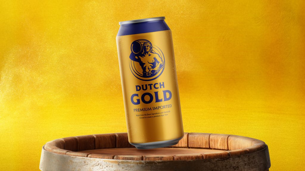
Minimalist Brand Architecture:Identifying and isolating the “Non-Negotiable” assets—the Sailor and the Gold—and removing secondary elements that diluted the brand’s impact.
The “Blank Canvas” Philosophy:Treating the physical can as a high-end design object, using a simplified colour palette to create maximum contrast and “thumb-stop” appeal in digital and physical aisles.
Typographic Modernisation:Redesigning the Dutch Gold wordmark to align with contemporary craft and premium lager aesthetics, ensuring legibility at distance.
The Implementation
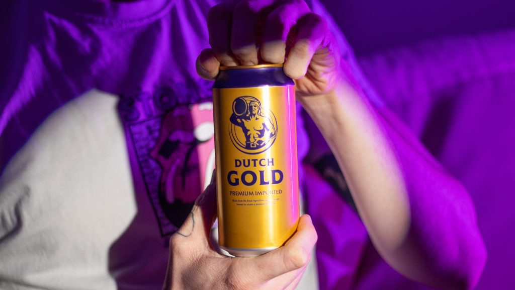
The Golden Can Execution:Pivoted the primary packaging to a high-sheen gold finish, creating a literal representation of the brand name that previously hadn’t been fully utilised.
Iconic Character Refinement:Re-positioned the Dutch Gold sailor as the central anchor of the design, ensuring long-term fans maintained an emotional connection during the rebrand.
Integrated Launch Strategy:Deployed a series of digital animations and social assets to introduce the “New Look” to the Irish market, framing the change as an evolution of a classic.
The Results
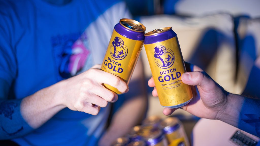
Total Visual Disruption: The new design achieved immediate shelf-edge standout, successfully navigating the transition into a post-MUP retail landscape.
Preserved Brand Equity: Successfully modernised a 30-year-old identity without alienating the core customer base.
Market Resilience: By elevating the brand’s aesthetic “perceived value,” Dutch Gold solidified its position as a premium-value icon in the Irish drinks sector.